Building an iPad App for Pilots

Executive summary
THE ASK
Qantas and GE partnered to build an app for the Electronic Flight Bag (EFB) that would provide commercial airline pilots with access to their airline’s aggregate flight data with the purpose of helping to plan for upcoming flights. We delivered an informative, easy-to-digest application that helped Qantas pilots make better fuel decisions and save carbon emissions due to adopting fuel-saving procedures.
THE TEAM
The core team of 19 consisted of product managers and owners, data scientists, engineers, safety analysts, 2 pilot subject matter experts (SMEs), and UX across GE and Qantas.
My role in the project was lead UX Designer, spearheading the evaluative research efforts, solution design and wireframing, and the visual and interaction design of the final product. I ran the design workshops and sprints with the team, as well as uasability testing with prototypes every step of the way. On the Qantas side, I had a part-time researcher and designer to help me with the workload, as needed. The part-time researcher was particularly helpful in gathering the generative research and helping me build out the Jobs To Be Done opportunities and journeys.
Research
Working with a part-time researcher at Qantas and the pilot subject matter experts, we dove into the research phase of the project.

Utilizing this data + recordings and in-person pilot interviews, my first step was to understand and create the journey map of a flight from the pilot perspective (one take off and landing). This helped me to look for pain points (too many decisions and too little time), environment constraints (dark mode necessary for a dark cockpit) and opportunities (high-level, easy-to-understand visuals) to inform my designs. I created a preflight checklist, journey map and personas for the project.

Ask questions, questions and more questions
To understand this audience better and to understand the tons of raw flight data available and how it could be manipulated and served up in an easy-to-understand way, I bugged the GE data scientists at every turn to help me understand flying, flight data, and a pilot's mindset. Most of the GE data scientists are pilots, as well, so I got to go on several up close and personl small plane flights. I loved it, my stomach, not so much. But when I set out to learn and empathize, I am committed (RIP chicken salad sandwich on a crossaint.)
Design
DESIGN WORKSHOP
Day One: Understanding the user and product goals
After a day of discuss and review of our research efforts we gathered the following insights:
- High noise to signal ratio
Pilots have to make scores of complicated decisions in a short amount of time and already have many sources of information. This can lead to decision fatigue and information overload. - Safety and fuel go hand in hand
Deciding to take on more fuel allows pilots to feel more secure they will have a safe flight. Habitually taking on more fuel than necessary can reflect a need for security in the face of unknowns, which is a powerful motivator. - Reliance on experience
Aggregate data for route information is difficult to get. In situations of novelty or uncertainty, pilots rely on one another or their own experience to tell them what they need to know. - Trust in people over data
Asking a trusted colleague for advice carries more weight than asking a computer. In future iterations, it would be advantageous to include comments from pilots to underscore the human-derived nature of the data.
Day Two: Defining the MVP
On day two, we worked to define what we could build in time for our beta launch and optimal GA date. We prioritized our 25+ product ideas, based on the flight and airline data we would have access toand then plotted them on an Importance/Effort Matrix to determine which ideas and data points would be good candidates for our MVP. There was lively discuss trying to determine how much data and functionality we needed to be adoptable, making sure we would be able to commercialize the app for other airlines, and what would be feasible to build in out alloted timeframe. We fianlly all agreed we'd only to be able to tackle 3-5 data categories to start.
Day Three: Sketching
Time to ideate! Once we made it through the tough discussions and had a plan in place, I was able to split the team into groups for sketching sessions. Each team presented their ideas, we had more discussion and iteration, and ended our desgin workshop with a wireframe in hand ready to validate with pilots.


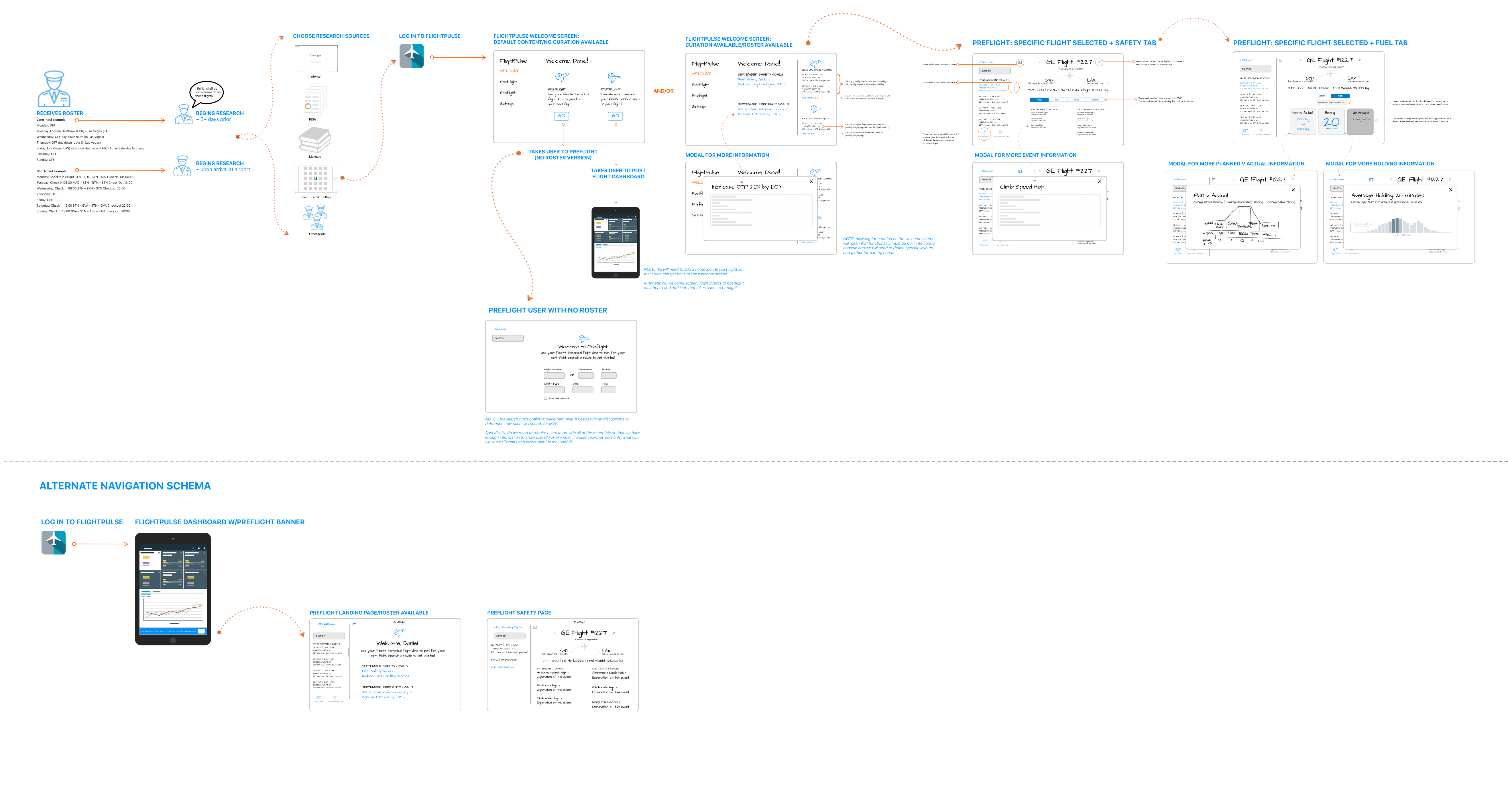
WIREFRAMES & PROTOTYPING
Every project has its mishaps, and ours was no exception. As we continued to validate our first set of wireframes the feedback we were getting was that our MVP didn’t have enough content to be viewed as valuable enough for pilots to open “yet another application.”
However, deadlines don’t go away and developers don’t grow on trees, so we had to make sure our MVP was buildable in the desired timeframe, while still providing enough value to pilots for adoption.
I went back to the drawing board and sketched out a solutions that incorporated all of the pilot feedback gathered from our initial concept (and all of its scope creep), taking it back to the full team for an iterative design thinking session on what quick wins we could achieve in addition to our identified features to make the product more adoptable.

To make sure we wouldn't run this issue again, with this phase of validation, I built a prototype with all of the functionality that had come from pilot feedback, that we knew we wouldn't have time to build. I interviewed 10 pilots and made them pick the top 5 important pieces of content. I asked them if they would use the app if it only had those 5 pieces of content. Thankfully, due to the scarcity/difficulty obtaining the type of informatin we were surfacing for pilots, they did validate that they would find the product useful and we were confident we could move forward with our MVP (the one buildable in the timeframe). I'm not going to lie, that was a rough couple of months.

VISUAL & INTERACTION DESIGN
The last phase was the visual and interaction design phase. I worked on visual designs straight from my sketches that the team agreed was the direction we would take to make our Beta date. Once designs were locked, I used Zeplin to get the specs to the engineering team and worked with them through their Agile sprints to get the product built to spec.
